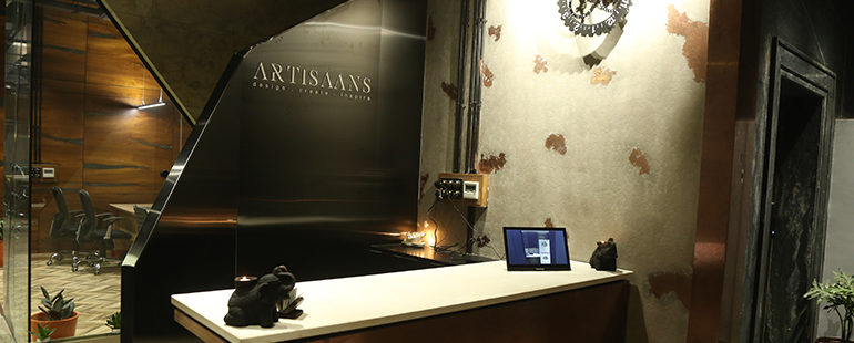
Offices Missing Strong Identities
- By: admin
- Commercial
Start-ups are blooming like never before. And with youths taking up the front, the sense of brand identity is at its top, digitally. The essence is keenly drawn from the ground. Then why is that, the offices nowadays lack a brand identity?
A house speaks more of a person than he himself can. It’s the intangible elements and spaces that let you experience the values of the built form. As Ar. Charles Correa shares on Gandhi Ashram at Ahmedabad,
“Between units, which shows you something about Gandhi Ji, have open spaces, where you can think about what you have seen.”
With growing competitors, strong brand identity is of utmost importance to user experience. Such that, even when you leave the space it stays with you. As we linger more on this, the spaces with most customer interactions, the lobby, waiting areas, when planned and designed thoughtfully make brand loyalists. This creates more engagement and results with a surplus in the commercial.While creating and planning office spaces, it’s the physical facilities that offer a sight to the office values. Since built forms are of permanence, balancing permanent elements as core values and flexibility with adaptable components is the key. We always need to incorporate flexible elements that can be moulded as per the relevance.
Space Branding has emerged as a strong addition to this. It can be pictorial, graphical or descriptive. A strong emphasizing illustration of your brand’s facilities, contribution or achievements leaves a deeper conviction of trust. They are also the carrier of your office’s culture to new additions in the organisation.
Spaces that witness interactive sessions or informal activities are the epicentre to such branding strategies. Space Branding dictates the spaces with or without branding elements where people interact the most about your brand.
Apart from architectural designing, colour palettes also play a vital role. As for colour psychology effects on our emotions. It also helps in creating an optimum work environment for all spaces individually branding its commitment to staff. Colour palettes are also used to enhance the story every space portrays to its user.
While we all put efforts to stay consistent in maintaining our e-portfolio on various social media accounts and website. Space Branding is the live exhibits of our office’s portfolio. So just like a portfolio, it’s important to repeat our core values in each space that we incorporate and display our features, facilities, and various other aspects in different spaces.
Instead of pulling off the cold corporate styles and cultures, developing your own palette keeps it warm and welcoming to the customer as well as employees. A personal touch always does the trick. The best example to relate to pictorial or descriptive space branding is the banks. They make sure to display facilities and comfort in such a way that you leave the space with the assurance of safety.
With multiple competitors emerging every day, the visibility of strong office identities is a matter of concern.
